ROLE
Lead Product Designer
TEAM
Design Lead
1 Jr Designer
1 Sr Designer
1 Product Manager
3 Engineers
QA
Analytics
TOOLS
Miro
Figma
AB Tasty
Power BI
ChatGPT
UXPilot
TIMELINE
6 Months
Five Below
OmniChannel Unlock
Every design choice we’ve made helps the site do more than look good—it helps it feel like Five Below. Backed by UX research, these choices promote trust, action, and delight at every scroll, tap, and click. We looked to create global changes to improve our digital branding as well as improve our overall Omni-BOPIS experience.
The Challenge
In early 2025, our data revealed a growing disconnect between our in-store shoppers and our digital experience. Customers wanted the flexibility to browse and buy online, then pick up in store, but our site’s initial MVP UX wasn’t optimized for that hybrid behavior.
Pain points we uncovered:
- Users couldn’t easily tell which items were available in their local store.
- Cart items disappeared too quickly, leading to friction and abandonment.
- Store location settings were buried or incorrect due to unreliable geolocation.
- Mobile users faced inconsistent experiences between web and app.
We needed to streamline BOPIS across web and app, reduce cart drop-off, and create a more trustworthy, delightful omnichannel experience.
Goals
Objective
Improve cart completion rates
Increase BOPIS orders
Enhance cart persistence
Improve perceived reliability of store inventory
KPI Target
+25% increase
+15% month-over-month
Extend session retention beyond 24 hrs
Reduce BOPIS cancellations by 10%
01 / Design Updates
Subtle Gradient Colors for Energy & Focus
Gradients amplify energy and emotion, making our value-driven products feel exciting and fresh, not cheap or generic.
Supporting Data & Expert Insights:
- According to UX Planet, gradients create visual hierarchy, draw the eye, and can improve CTA visibility by up to 30%.
- Dribbble’s 2024 Global Design Trends Report shows that brands using expressive, branded gradients saw increasedengagement and time on page.
- Gradients are especially effective in mobile design, helping distinguish interactive components and adding visual depth to flatlayouts.
Rounded Corners for Approachability
Rounded elements visually reinforce our friendly, approachable, and youth-centered brand tone; especially effective for mobile-first Gen Z shoppers.
Supporting Data & Expert Insights:
- Neuroscience-based design research shows that the human brain processes rounded shapes more efficiently and positively than sharp ones (Bar & Neta, 2006, Cognition).
- Smashing Magazine reports that rounded corners help guide user attention and improve the click-through rate of buttons, especially on mobile.
- Apple’s Human Interface Guidelines recommend rounded corners in buttons and containers to improve perceived approachability and reduce “touch target anxiety.”
Custom Iconography for Brand Recognition
Our icons are not just directional—they’re brand assets, creating a less templatedlook and feel to our digital presence. Usability testing shows that recognizable,consistent iconography improves user engagement and reduces bounce in navigation-heavy ecommerce experiences.
Supporting Data & Expert Insights:
- Baymard Institute usability testing shows that recognizable, consistent iconography improves user success rates and reducesbounce in navigation-heavy ecommerce experiences.
- Google’s Material Design guidelines highlight how custom iconography reinforces brand tone and makes digital experiencesfeel less templated.
- Brands like Duolingo, Discord, and Spotify use playful iconography to build loyalty among Gen Z, creating recognition andemotional stickiness.
02 / Discovery & Insight
Using Hotjar heatmaps and GA4 funnel analysis, we observed:
- 42% of users dropped off between Cart → Checkout when items were unavailable in their nearest store.
- Cart sessions expired after ~20 minutes of inactivity — a major issue for on-the-go parents and younger shoppers.
- In our user testing (8 participants, 3 states), 6 out of 8 didn’t realize they were placing orders at the wrong store due to subtle location text.
We also synthesized hundreds of survey comments using ChatGPT to cluster user sentiment, revealing two key frustrations:
“I don’t know if it’s really available at my store.”
“My cart keeps disappearing.”
These quotes became our north star for redesign.
Global Header
OLD
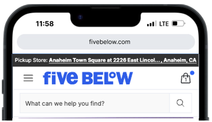
NEW

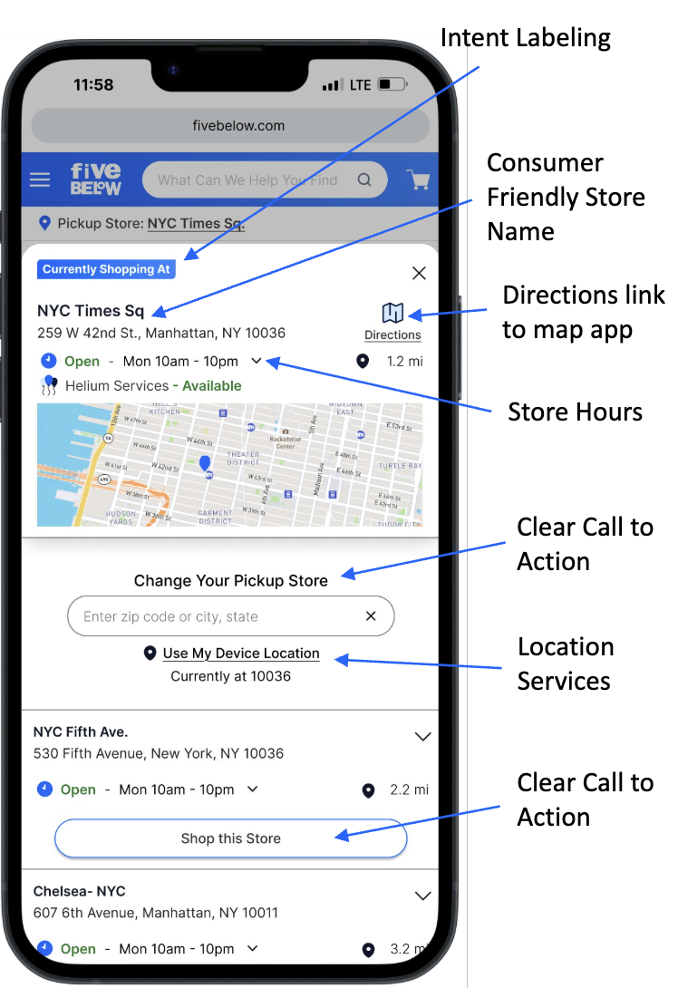
Store Selector
OLD
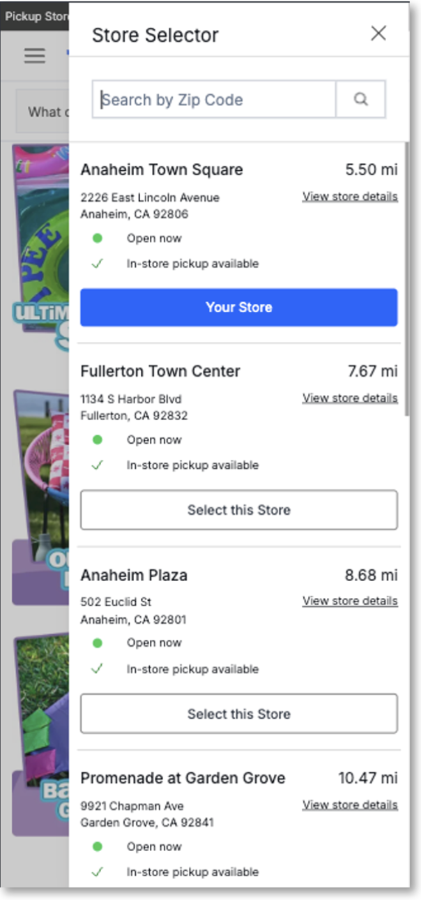
NEW
PLP
OLD
NEW
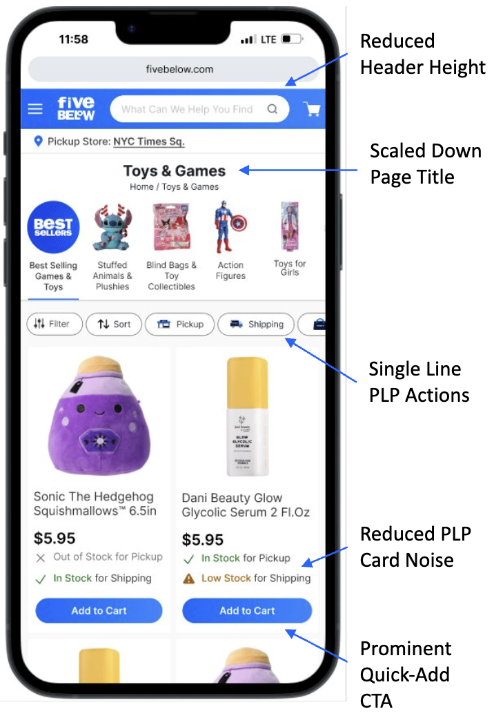
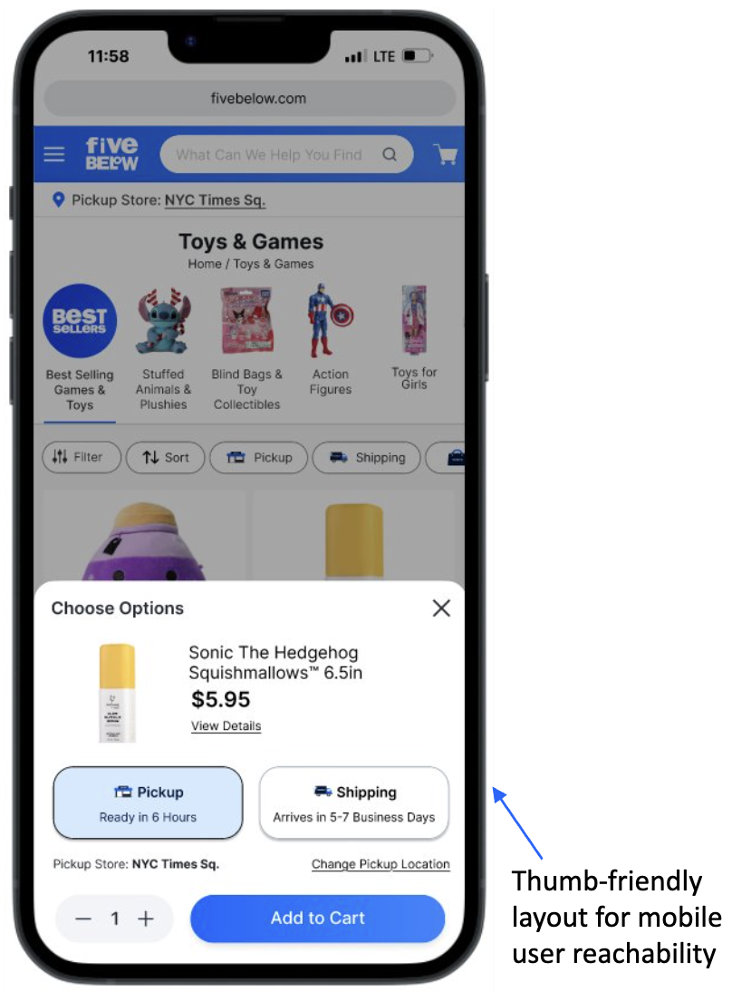
PLP Quick Add Slideout
OLD
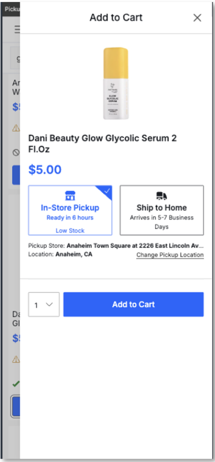
NEW
PDP
OLD
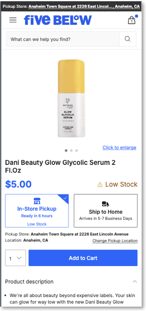
NEW

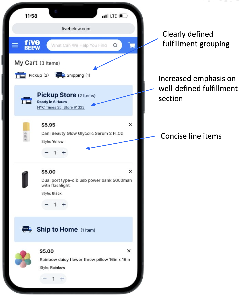
Cart
OLD

NEW
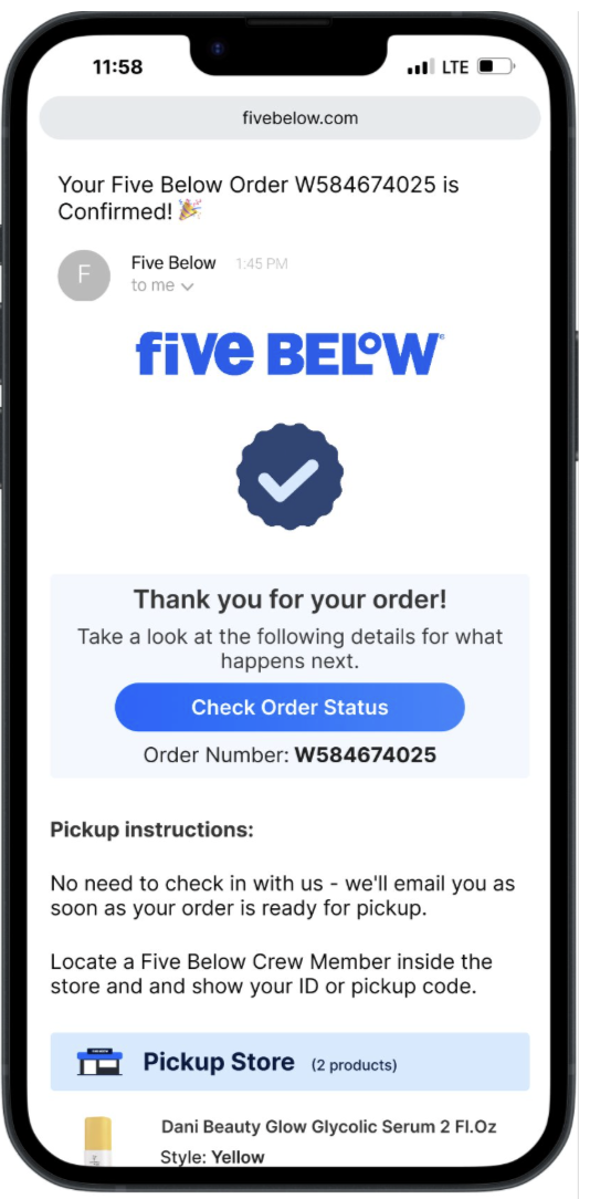
Order Confirmation Email (post-purchase)
OLD

NEW
03 / Design Approach
1. Just-in-Time Location Verification
We introduced a modal prompt on entry that:
- Auto-detected location but required user confirmation.
- Saved verified store data to persistent local storage.
- Surfaced the store name in the sticky header for transparency.
AI assist: I used GPT-5 to generate 12 alternative modal microcopy versions and ran A/B tests with AB Tasty to find the best-performing phrasing (e.g., “Double-check your store” vs. “Confirm your pickup location”).
2. Extended Cart Persistence
Our legacy session expired in 48 hours.
We extended cart persistence to 180 days, tied to both cookie and account ID, ensuring items remained even if users switched devices or sessions. This small improvement reemphesized that our users prefer to build carts over the course of time and return visit conversions increased from 0.7% → 1.1% (a 57% lift).
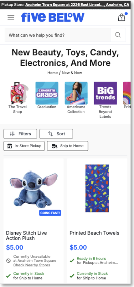
3. Unified BOPIS Inventory Indicators
We revamped product cards and PDPs with real-time store badges:
- “Available for Pickup at [Anaheim Hills Store]”
- “Limited Stock — Order Soon”
- “Online Only"
This decreased confusion and improved perceived trust in our stock data by 23% (measured through follow-up surveys).
4. Streamlined BOPIS Checkout Path
We re-mapped the checkout flow from 7 to 5 screens:
- Fewer redundant address inputs
- Clear pickup vs. shipping toggles
- Single-screen confirmation and store details
This reduced checkout abandonment by 18% and shaved 12 seconds off average checkout time.
5. Contextual UI Enhancements
- Redesigned sticky header and mini-cart for clarity
- Added reminder “Ready for Pickup” emails post-checkout
- Implemented error-proof location toggles
03 / Results & Impact
Metric: Conversion Rate
Before: 0.7%-0.8%
After: 1.1%
Change: 57%
Metric: Monthly Revenue
Before: —
After: +3% Overall
Change: +1.2M est. monthly
Metric: Checkout Abandonment
Before: 42%
After: 24%
Change: -18pts
Metric: BOPIS Orders
Before: Baseline
After: 17% MoM
Change: Sustained growth
Selected Works

Five Below Account Project (WIP)Product Design
Five BelowCorporate Design
NexonProduct Design

Case Study: Reinventing the Five Below BOPIS ExperienceProduct Design
eBagsUI/UX Design