Nexon
Checkout Flow Redesign
During my initial interviews with Nexon, I pitched the need for a redesign of their checkout flow as it was unnecessarily cumbersome for new and returning users alike. 18 months after my hire, I was finally able to get my project greenlit after a company restructuring and access to more developers to work on this project. After creating a service proposal and presenting to the senior management of Nexon America, work began in mid Q4 2020. What follows below were what issues I felt needed to be addressed, why, and solutions to the problems.
UX Audit - Why the need for a redesign?
Too many steps (clicks and input fields)
Payment Gateways are not easily interchangable
No coupon redemption or discount code
No expedited flow for returning users
Entire FAQ section links off page (no functions accordian)
Inconsistent warning/informational messaging
Intro
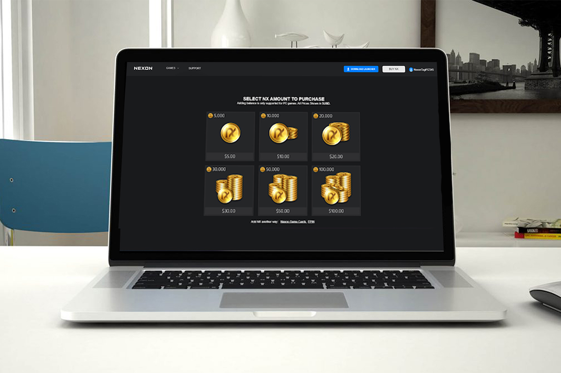
Taking a holistic design approach to when examining this previous flow I identified 1 key flaw, the checkout process was backwards. User's we're having to determine how they're going to be paying for a product, NX in this case, before selecting the actual product. It'd be like signing on to Amazon, choosing Visa as your payment method, and then starting to shop. Returning users might have gotten used to this experience after repetition but it would probably seem awkward to new users making purchases for the first time. My goal was to redesign the flow to be closer to user's already ingrained and understood process of purchasing items online.
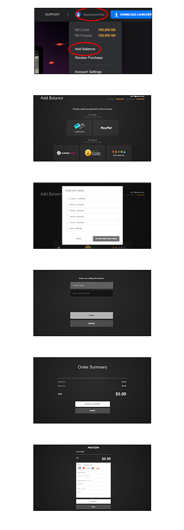
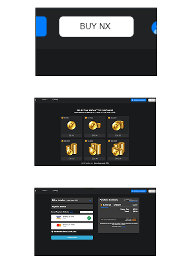
01 / Too Many Steps
OLD
NEW
02 / Expedited Returning User Experience
The key driver behind elevating this experience was to get the players back in the game as fast as possible because that's what the users and buiness both want. There were several lengthy input interactions that were addressed and optimized for our returning players.
OLD
Gaps that could be addressed for returning users
- There is real estate in the Global Navigation so why not elevate the "Add Balance" CTA out of a click dropdown nav and make the revenue driving "Buy NX" CTA more prominent.
- Returning users should not have to enter their zip code manually every time. As it was a business requirement to have users acknowledge their zip code (current IP and billing), I suggested detecting their location, storing it (as its non-sensitive information), and auto-populating after their first purchase.
- In the middle of the checkout flow there is an “Order Summary” confirmation page that feel unnecessary and rather just adding another click to confirm view only information rather than just displaying it throughout the flow.
- The payment processing step not being able to store credit card information was such an obvious addition that was just overlooked but it’s a common practice now that returning users almost always expect it on sites they frequent, either by the merchant or the browser they’re using.
NEW
Results
The average checkout time with the previous checkout flow was 2:06 across all payment gateways, the new design landed at about :32 during pre-launch testing (both averaged all payments gateways in the Western region) with a 7% boost in completion success.
Selected Works

Five Below Account Project (WIP)Product Design
Five BelowCorporate Design
NexonProduct Design

Case Study: Reinventing the Five Below BOPIS ExperienceProduct Design
eBagsUI/UX Design