ROLE
Design Manager
TEAM
Lead Designer
Sr. Designer
Production Designer
DS Engineer
TOOLS
Miro
Figma
GitHub
TIMELINE
4 Months
Case Study
Redesigning the
Five Below Design System
As the digital footprint of Five Below expanded, the need for a cohesive, scalable, and highly efficient design infrastructure became critical. We needed a system that didn't just organize our Figma files, but actively accelerated our product development lifecycle. The existing workflow between design and engineering was creating bottlenecks: handoffs were manual, visual regressions were common, and both design and development teams were spending too much time pushing pixels rather than solving customer problems.
By fundamentally restructuring how we treat design decisions—translating them into Tailwind code tokens and syncing them directly to GitHub—we transformed our design system into a shared, automated engine that exponentially cuts down development time and QA bug issues.
Impact
We immediately saw a drastic reduction in development cycles and visual QA tickets. By automating the pipeline between Figma and our code repositories, we achieved an exponential decrease in the time required to spin up new features. This streamlined process allows us to cut design and development resources on every project, significantly improving overhead costs and team efficiency while guaranteeing a highly consistent UX across the entire Five Below site.
Audit and Preparation
Diagnosing the Disconnect
Before overhauling the system, we audited the existing workflow and uncovered several core inefficiencies draining our resources:
- Manual Translation: Designers were creating high-fidelity mockups, but engineers had to manually inspect files and hardcode values (hex codes, spacing, typography). This left room for human error and styling inconsistencies across different pages of the Five Below site.
- QA Bloat: Because design and code were entirely separate entities, our QA team spent an exorbitant amount of time logging visual bugs—wrong padding, incorrect brand colors, or mismatched typography.
- Resource Heavy: Every new project required heavy lifting from both designers (redocumenting specs) and developers (rebuilding or modifying existing components), inflating project costs and timelines.
If we wanted to scale our e-commerce and digital experiences efficiently, we had to eliminate the friction between the design tool and the codebase.
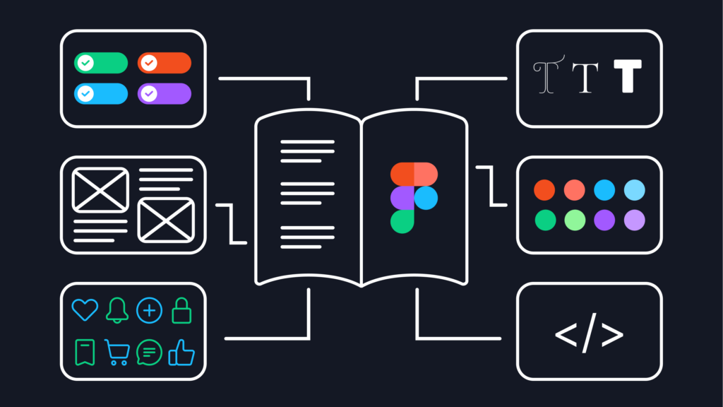
Structure
Building a Token-Driven Architecture with Tailwind
To solve the translation problem, we rebuilt the foundation of our design system using Tailwind code tokens. Instead of relying on static hex codes or arbitrary pixel values, every design decision was abstracted into a semantic token (e.g., color-brand-primary, spacing-md, radius-lg).
We mapped our entire visual language directly to Tailwind utility classes. This meant that when a designer applied a color or a layout gap in Figma, it directly correlated to a specific, pre-existing Tailwind class in the engineering environment.
Automating the Pipeline via GitHub
The true breakthrough in our efficiency came from linking our design environment directly to our engineering repositories.
Using Figma Variables and automated pipelines, we established a workflow where design tokens are pushed directly to GitHub.
- A designer updates a core brand color or spacing token in the master system.
- That change generates a pull request in GitHub containing the updated JSON token files.
- Once approved, the Tailwind configuration is automatically updated across the entire codebase.
This pipeline eliminated the "handoff" phase entirely for foundational styles. Engineers no longer have to guess values or write custom CSS; they simply consume the Tailwind tokens that design controls.
Operations
Streamlining the Design and Build Process
With the Tailwind and GitHub integration in place, the day-to-day operations of both teams transformed.
- Accelerated Prototyping and Build: Designers now design with the constraints of the code. Because our Figma components mirror the Tailwind components one-to-one, what you see in the design file is exactly what renders in the browser. Developers can build layouts in a fraction of the time by stringing together the utility classes defined by the tokens.
- Drastic Reduction in QA: By removing manual styling, we virtually eliminated visual regression bugs. QA teams no longer need to measure padding or check hex codes; if the component uses the correct token, it is guaranteed to be visually accurate.
- Resource Reallocation: Because the system handles the heavy lifting of UI consistency, we can now execute projects with fewer dedicated design and development resources. Teams are no longer bogged down by UI debt and can focus on complex UX flows, user testing, and feature innovation.
Conclusion
ROI and the Future of Five Below's UX
The success of a design system isn't just about making things look good; it's about fundamentally changing how a business builds websites.
By treating our design system as a fully integrated product—powered by Tailwind tokens and synced seamlessly through GitHub—we achieved massive operational efficiencies. We are now able to deploy updates faster, with significantly fewer QA issues, and with a leaner allocation of resources per project. Ultimately, this approach has radically improved our overhead costs while delivering a tighter, more consistent, and highly polished user experience for Five Below's customers.
Selected Works

Five Below Account Project (WIP)Product Design
Five BelowCorporate Design
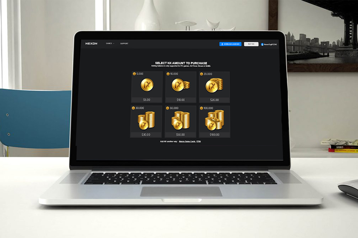
NexonProduct Design

Case Study: Reinventing the Five Below BOPIS ExperienceProduct Design
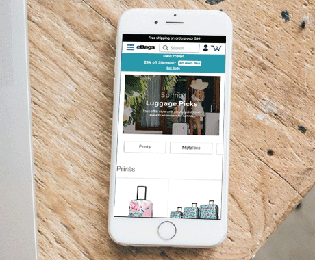
eBagsUI/UX Design