eBags
Feature Enhancements
At eBags, I oversaw the entire navigation and user flow, ensuring a seamless customer experience from site entry to checkout. Early on, I led a key project to enhance UI/UX for global navigation across all device types. Collaborating with merchandisers, creatives, photographers, front-end developers, QA, and marketing teams, I focused on designing and optimizing navigation experiences, driving significant improvements in the overall customer journey.
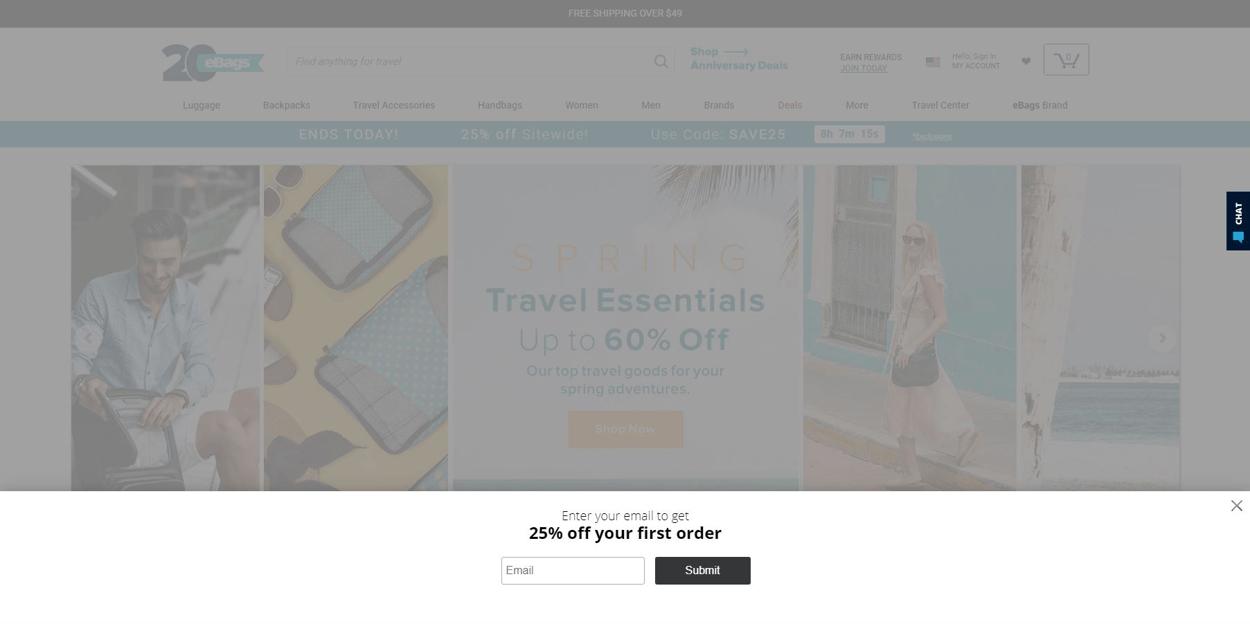
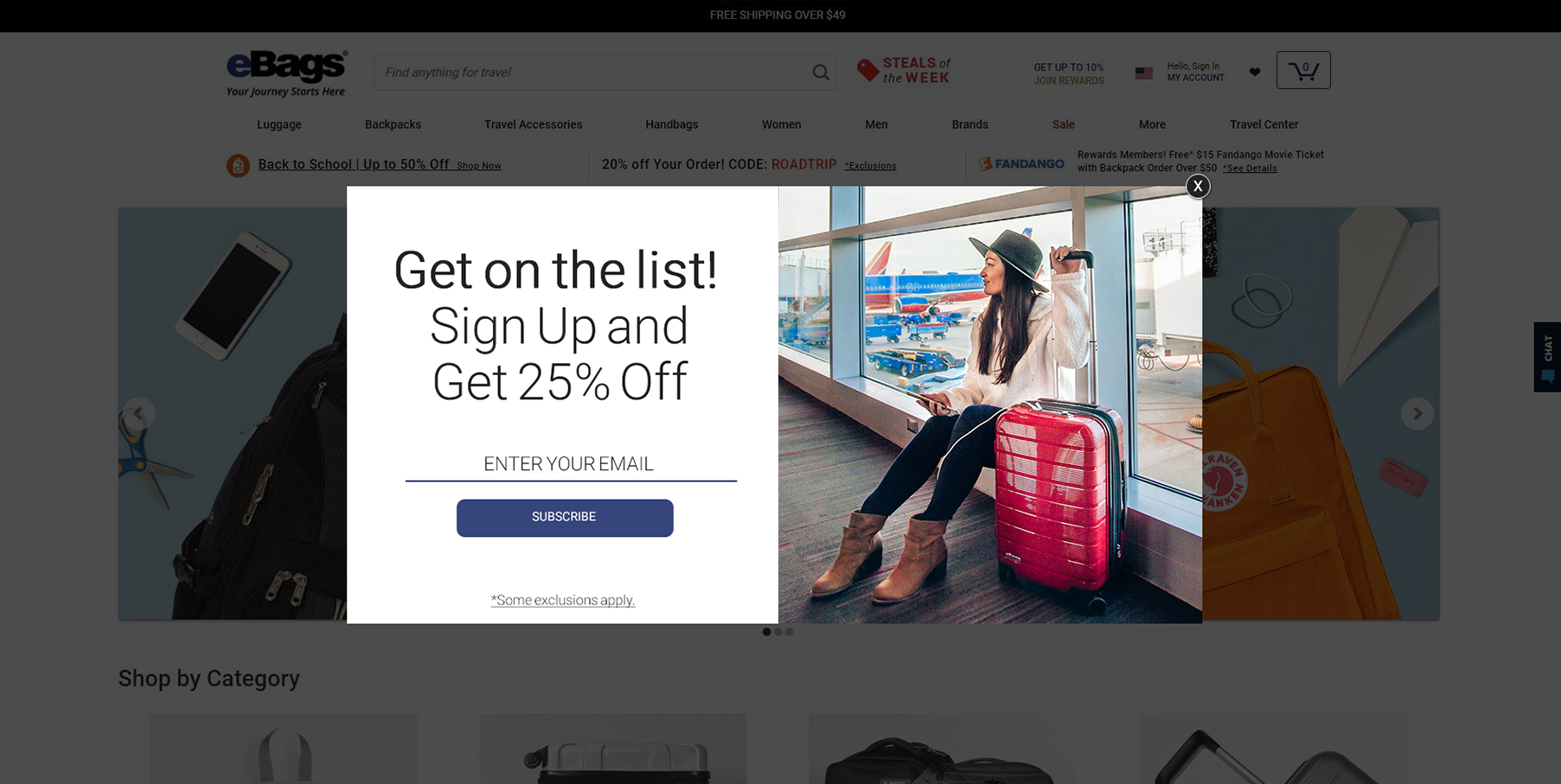
01 / Email Lightbox
The email channel was a huge This had been an ever evolving project as there were numerous list pages with a wide variety of sub-categories to feature. Mobile solutions have been the most difficult to decipher as eBags needs to feature stories (for continuation) from other pages as well as save vertical space
OLD
NEW
02 / Desktop Flyaway
For the desktop flyaway, I decided to go with a more isolating design that keeps the full focus on the flyaway experience. Making the width 100% and blurring the background under the flyaway, it keeps the user's focus on the task of navigation without being distracted by imagery featured below.
OLD
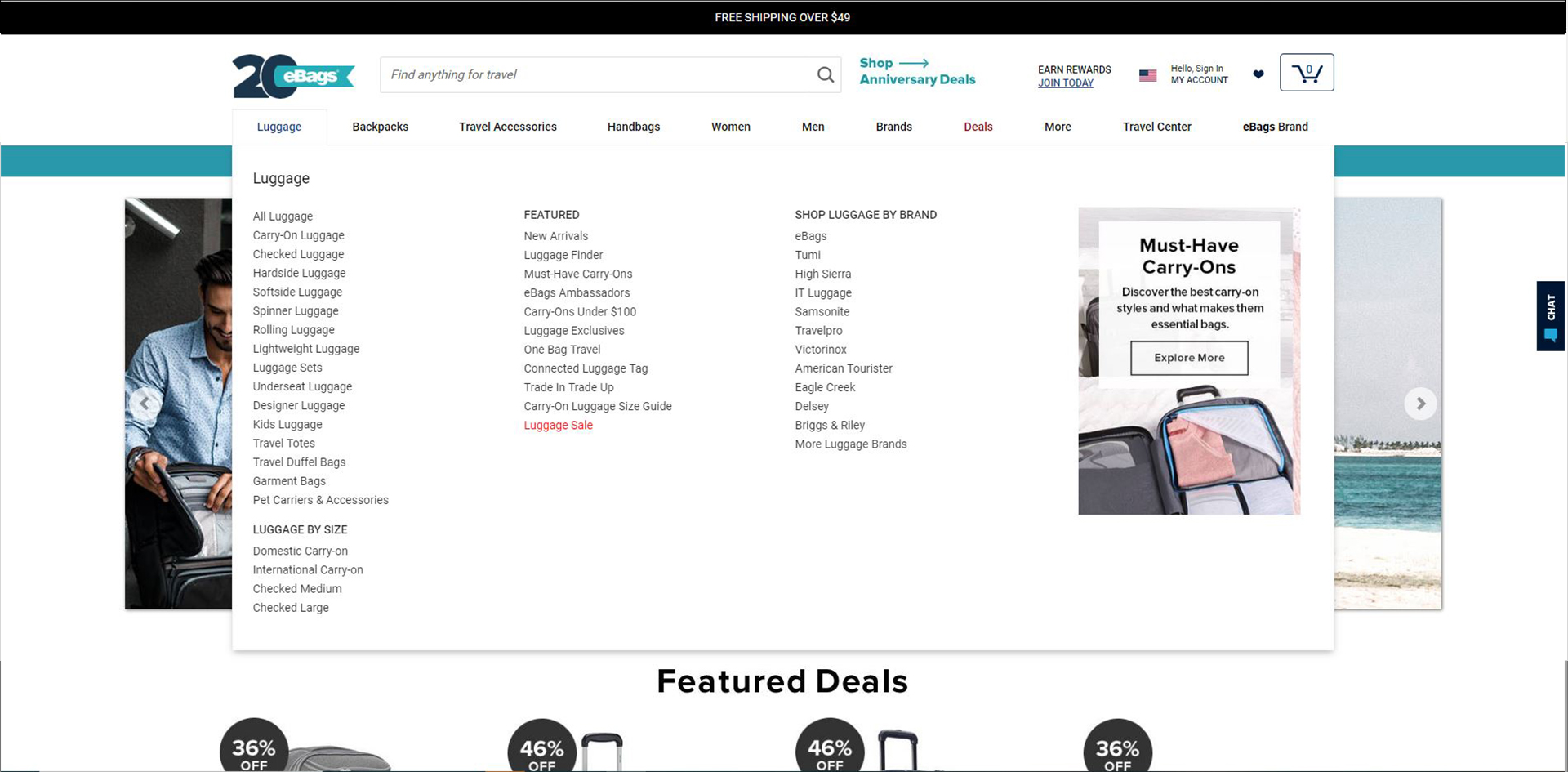
NEW
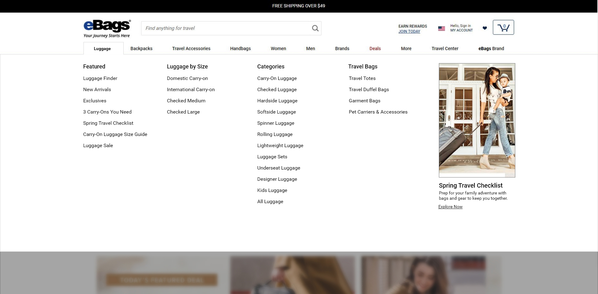
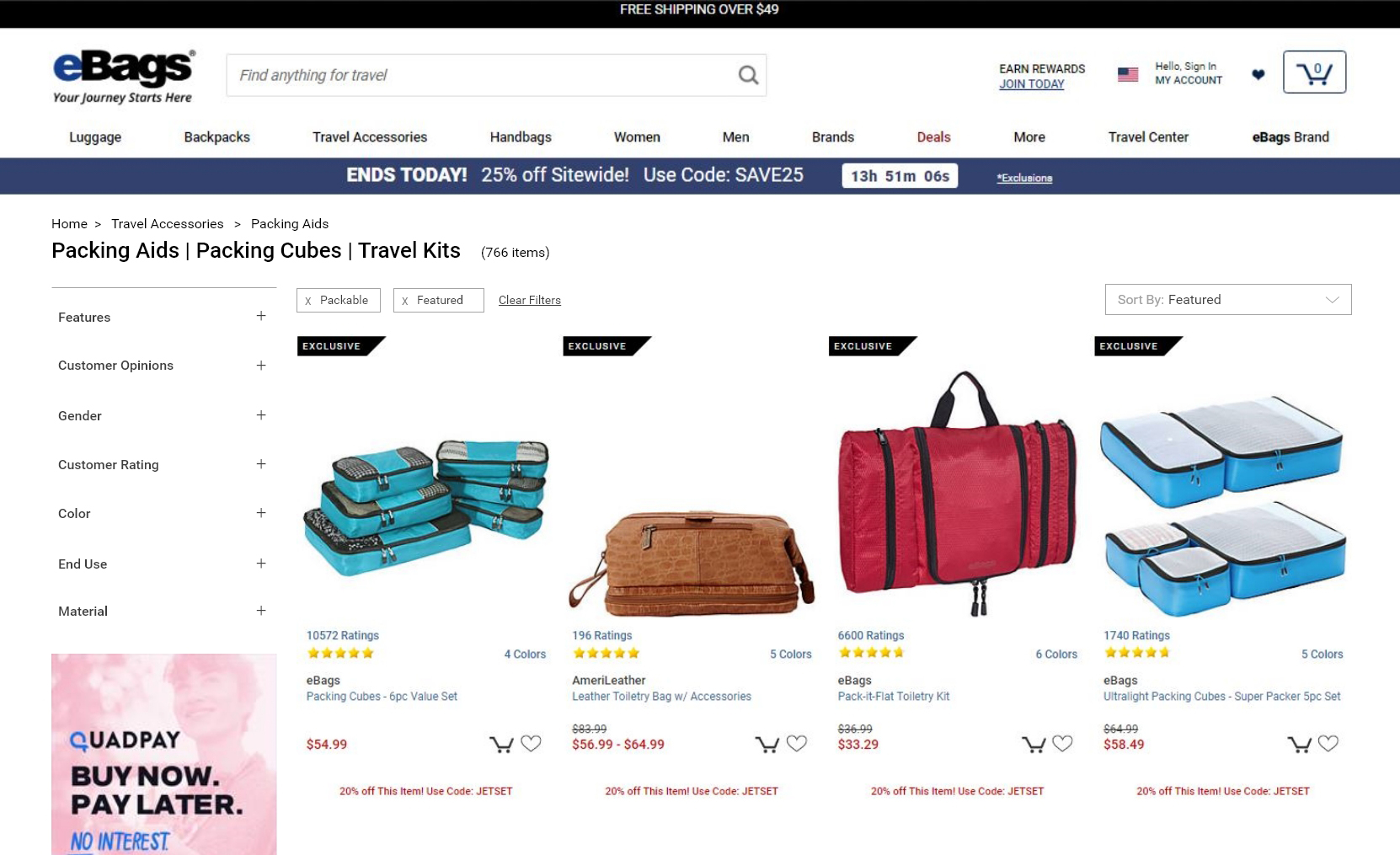
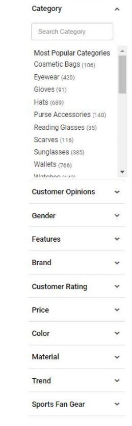
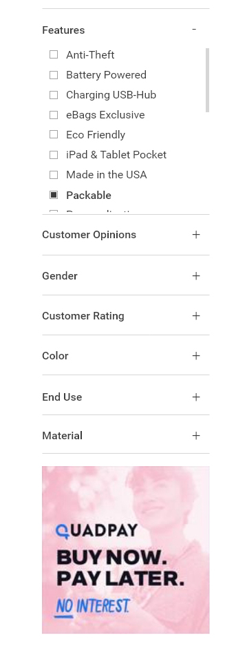
03 / Horizontal List Page Navigation
The main objective of this redesign was to eliminate white space on top of the left navigation and condense the room taken by the active filters and sorting dropdown.
OLD
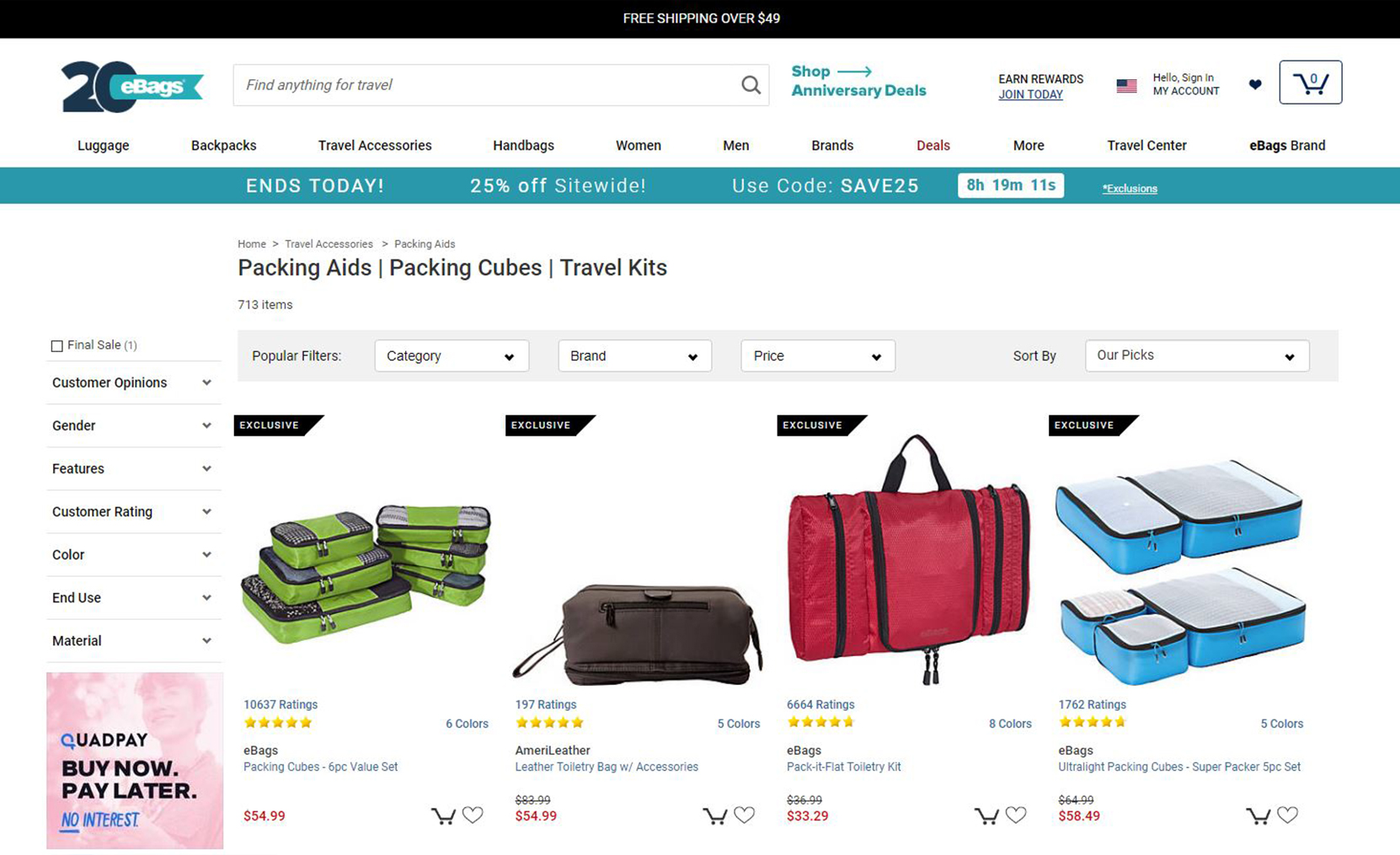
NEW
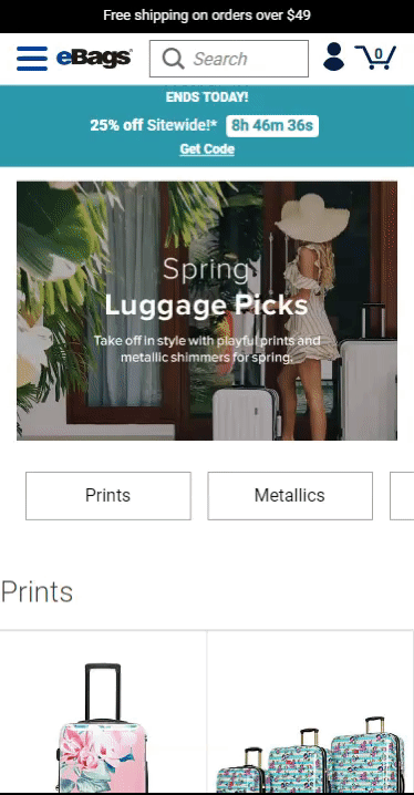
04 / Mobile List Page Visual Navigation
This was the biggest challenge during my time at eBags. The new design below was the visual navigation with the best list page conversion rate. Consolidating mobile real estate and creating an evergreen experience using scrolling text were the key driving factors behind this design choice.
OLD
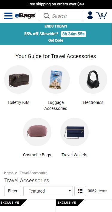
NEW
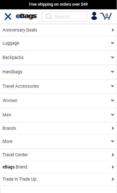
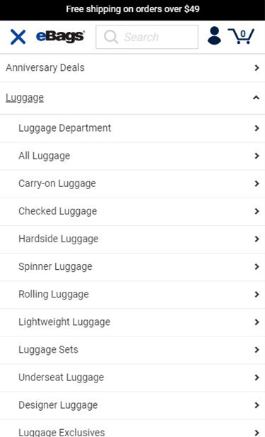
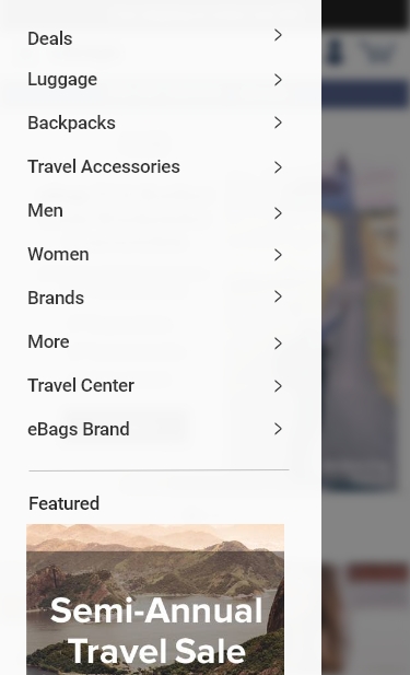
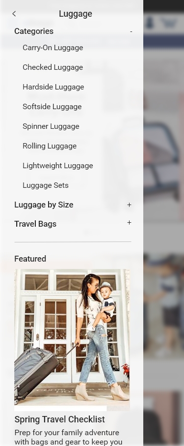
05 / Mobile Hamurger Menu
Keeping consistent design with the desktop experience, I designed a 75% width panel flyaway with a panel shift first interaction and twirl down second interaction.
OLD - 1st Level
OLD - 2nd Level
NEW - 1st Level
NEW - 2nd Level
06 / Filtering UI
A clean and consistent design with similar elements used in the mobile flyaway was the main goal for branding consistency.
OLD
NEW
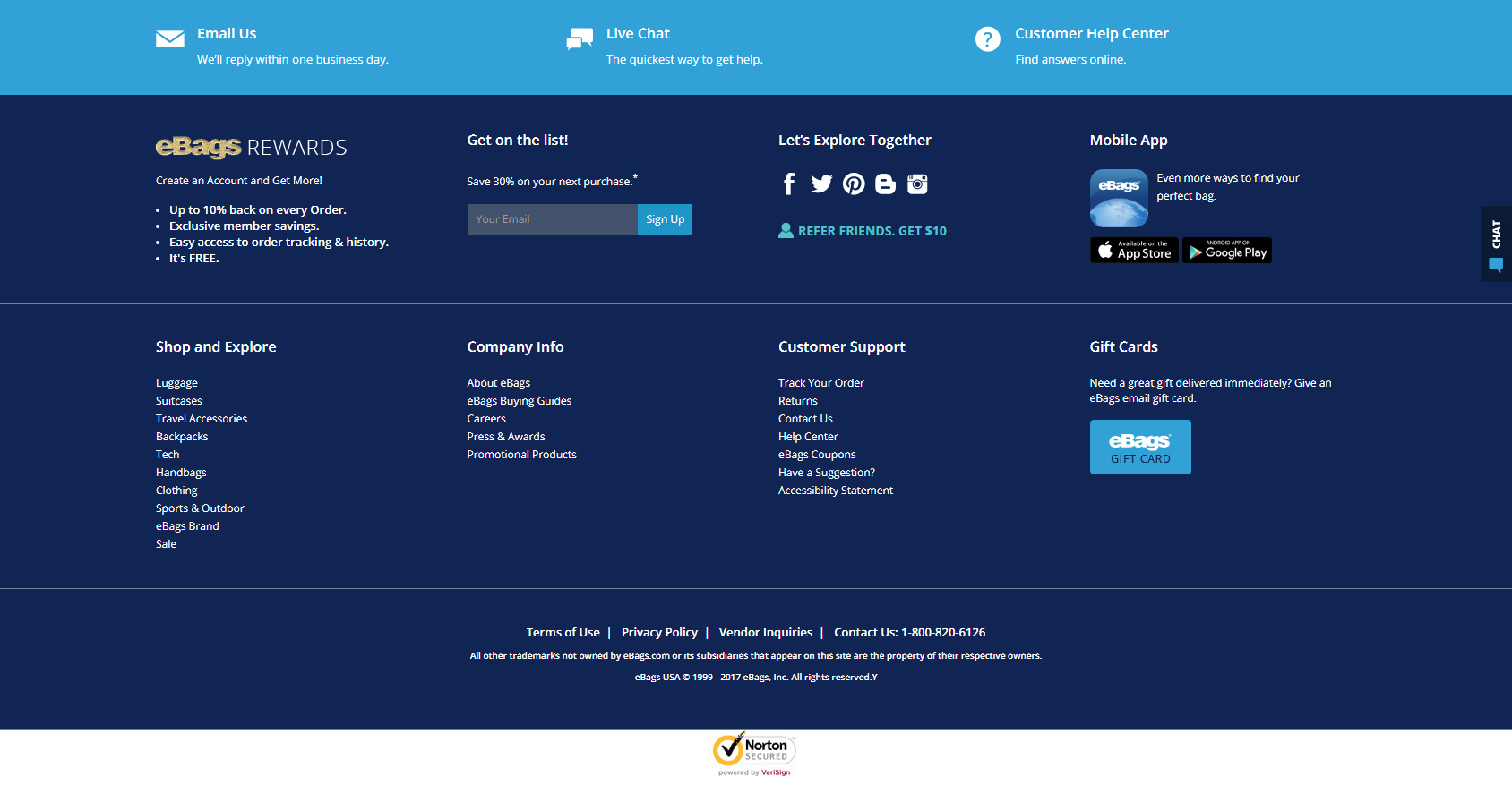
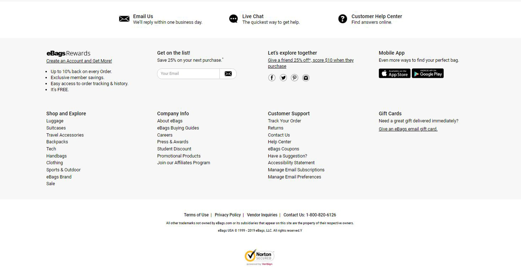
07 / Footer
The dark blue background was much too heavy on the page and I chose a much more clean and light experience to anchor the page. Redesigned using the design system components for a cohesive experience on global elements.
OLD
NEW
Selected Works

Five Below Account Project (WIP)Product Design
Five BelowCorporate Design
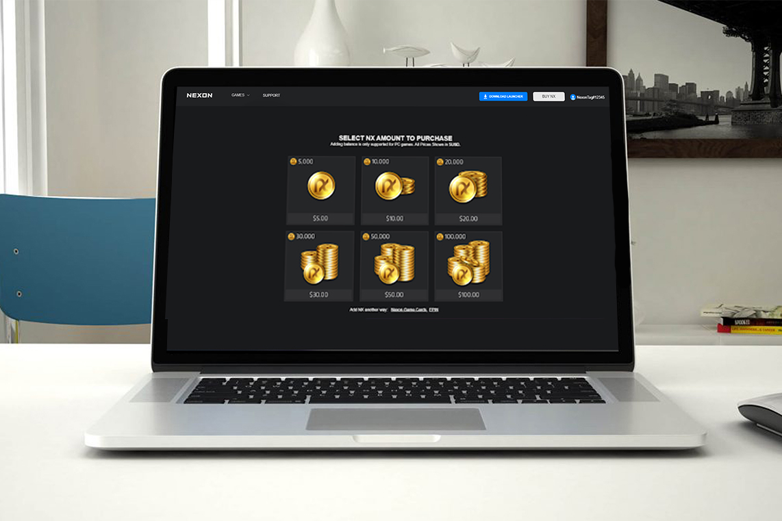
NexonProduct Design

Case Study: Reinventing the Five Below BOPIS ExperienceProduct Design
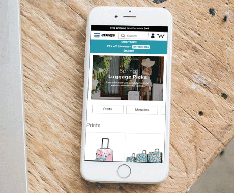
eBagsUI/UX Design
© 2025 Brandon Ramlet